Website / site architecture / uX / Ui / Visual Design
San Francisco Municipal Transportation Agency | SFMTA
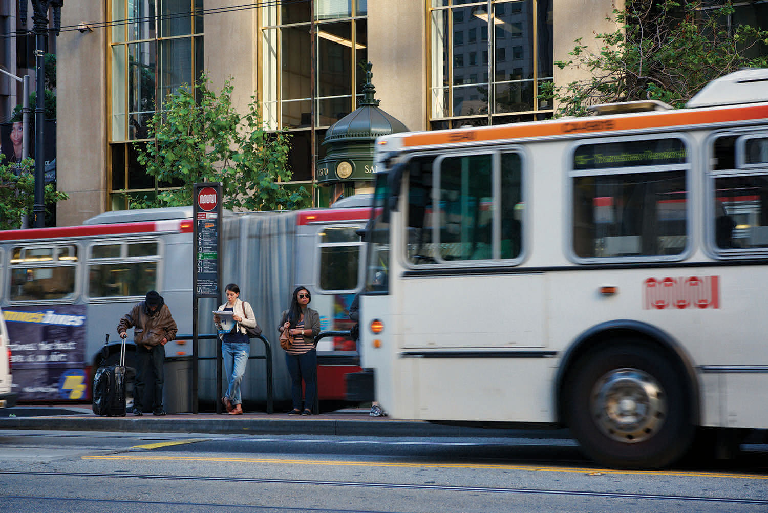
In 2016, we were awarded the contract to overhaul the SFMTA’s website with Green Ideas (project management) & FivePaths (development). The SFMTA is an umbrella organization, overseeing all aspects of transportation in San Francisco: the famous cable cars, public buses and street cars (Muni), taxis, parking, bicycles, and pedestrians infrastructure.
The website contains an enormous amount of information - over 15,000 pages. It’s used by a huge variety of user types for all sorts of tasks, including bus routes, parking tickets, trip planning, infrastructure project information, and parking regulations.

Structure
Re-design
We began by interviewing over 80 SFMTA employees, external stakeholders, and users to find out what they enjoy about the existing site, and what their barriers and real needs are. This became the basis for our design guidelines.
Our first imperative was to make the site easy to use, welcoming, modern, and friendly. Tasks with negative connotations (paying a ticket, getting a permit, etc.), needed to become more easily accessible.
The new design is based on hero images, quick tools for immediate tasks, and thumbnails that let visitors travel through the San Francisco’s MTA site with their thumbs, especially since 65% of all site visits are accessed via smartphone.

“InkëDesign approached our complex website redesign with a great balance of user research, best practices and excellent design skills. They are a pleasure to work with and we couldn’t be happier with the look and usability of our new website.”
Simplified navigation
Customer Tasks made easier
We implemented a couple of features to allow simple and more direct access to the huge variety of content on the page. There are drop down Quick Links to top-trafficked requests, a Buy Fares button to drive revenue, an updated site-wide search function, and a Trip Planner for different modes of transportation. Thumbnail Navigation offers clickable images to access sub-landing pages that organize content by themes: visitors, neighborhoods, services, modes of transportation, accessibility. We also created a system to filter content and enhance discoverability.
These features make the site Mobile-Friendly and easier to navigate in general. The old site’s drop-down navigation bar was not user-friendly for smartphone users. We set out to make a better web design that filters content and enhances discoverability on the site with smartphone users in mind.


features
Dynamic Design
New content was curated by the agency to meet the different needs of the people they serve, such as a new section for “Visitors,” and a different one for “Neighborhoods.” You’ll also find mode-specific pages, where users can find Bike, Walk, Muni, and Drive & Park information in one place.
Design modules | The old page had very limited design capabilities. Most pages were heavy on text, and pages in sections all looked different. Now pages like“Projects” have unique modules to display timelines, icons to indicate the improvement purposes, and images galleries. We updated the media and blog page. We also added a newly-designed calendar and made map-based search possible wherever SFMTA had the data available. In the future this feature will be included in more and more of the site.
Better Search | We upgraded search functions, so that search returns quickly comb through uploaded PDF files as well. We’ve also indexed all of the Board items, so it’s easy to find legislation.
More Dynamic Features | Site-wide there are content feeds with dynamic content like News & Blog, Calendar, and Travel & Traffic Impacts that get pulled in to supplement the main content.
More Inclusive | Web translation functions have been upgraded. There is now an Accessibility section, that highlights the SFMTA’s work in making transportation available to all.
Technical Upgrade | While the security and functionality of SFMTA.com were sturdy, this was our chance to address concerns about the website growing outdated. Our updated back end will allow us to be more agile and to introduce new capabilities on an ongoing basis.
Thank you to all the participants who gave us feedback and guided our web redesign efforts.

