EDUCATIONAL STRATEGY / Way finding & signage / EXPERIENTIAL DESIGN
Waste Water Treatment Plant Design Guidelines | SFPUC & AECOM
In 2016 AECOM was helping the San Francisco Public Utilities Commission develop design guidelines for their South East Wastewater Treatment Plant. AECOM tasked us with developing engaging way-finding and enhancing how the plant communicates with its surroundings, with the goal of turning the plant into an approachable, proud, and educational facility.
San Francisco's South East Waste Water Treatment Plant | SEP
Architectural Influence
Design Strategy
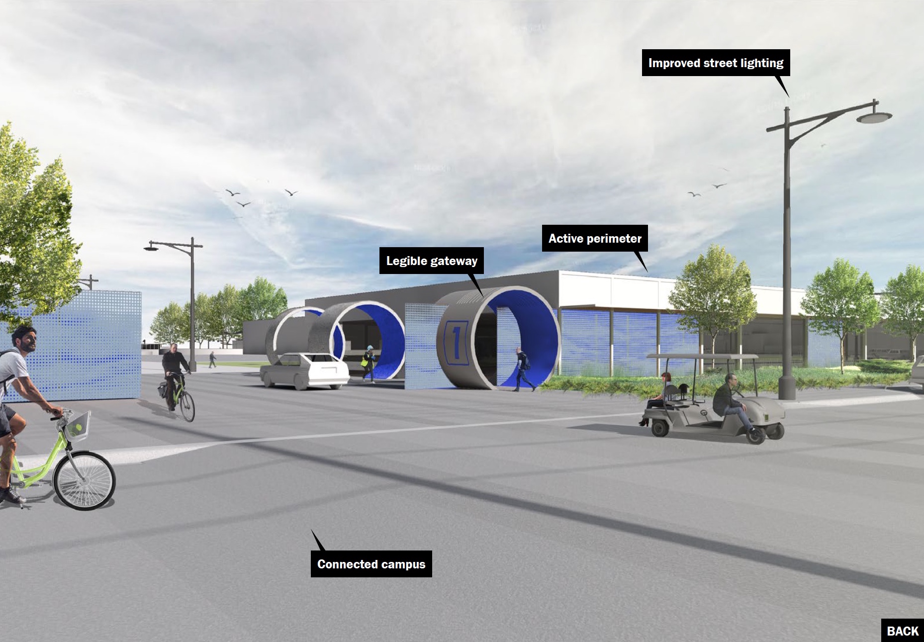
Instead of simply designing signage that explains how the facility works and where to go, we integrated the way-finding into the building infrastructure, influencing the architecture, the layout of the campus, and how the entrances are configured.
“Inke & Peter expertly complemented our architectural team. The result of our collaboration was a cohesive, and memorable architectural vocabulary that incorporates way-finding and signage in imaginative ways”
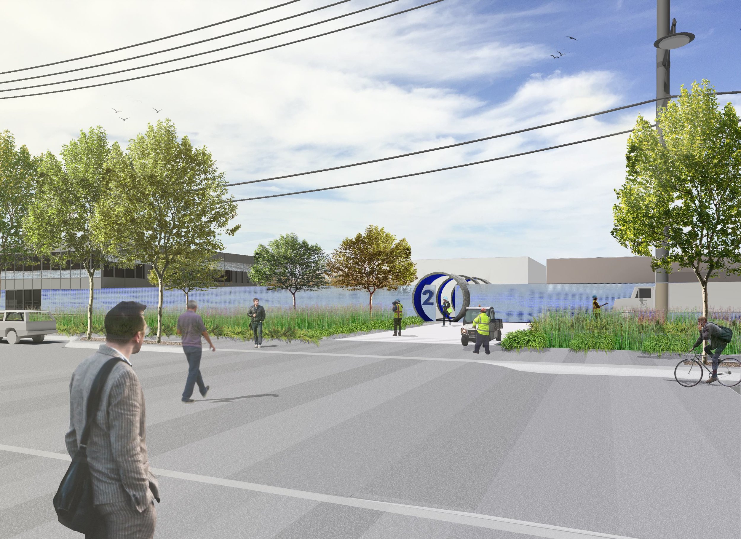
Functional Design Elements
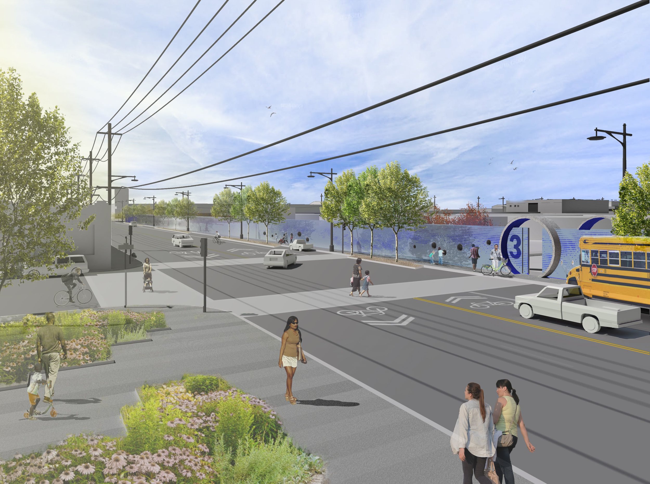
Entrance Portals & Seating Pods
Everything is designed around the user experience, not just for visitors, but also for workers. We made the pipe itself an entrance feature, improving how workers arrive at their workplace. Signage and for seating situations now use soundscapes and lighting to transmit intuitively water levels and workload.
Public engagement
Portholes
We made the defensible parameter around the campus more transparent with portholes that show live periscope images of the facilities.

COMMUNITY OUTREACH
Interim Visitor Center
Located at the corner of Evans Ave and Phelps Street will be the visitor center / new classroom that will help bridge the gap for the community by communicating what the SFPUC is working on over a 25-year period.
We applied the same principles to our design of their new Visitor Center as we did with "The Perfect Classroom." In the future the plan will be to develop and build hands-on experiments in collaboration with the Exploratorium.
Phelps Street
Concept is to have a modular interior that's easy to format for presentations, work groups or gallery style viewing.
Architectural drawings by AECOM
EDUCATION
The Perfect Classroom
Due to Jens-Peter's extensive knowledge in education, we were able to create a lesson plan on how the water system works. After attending and observing the existing tour, we were able to develop an improved structure to the guide.
We turned the lesson into a hands-on experience. Students and visitors discover through experiments how the facility works. Over the course of the lesson, we motivate the visitors to become investigators and engineers to solve problems themselves. With a simple, hands-on experience, we send people home as stewards of the environment.
Diagram
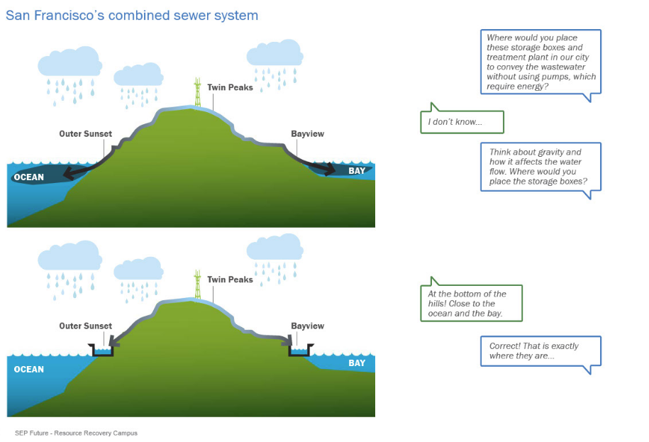
Waste Water Process Diagram
This diagram is used as another way-finding tool throughout the campus to show which building is responsible for which part of the process.
Diagram carved into the concrete
WAY-FINDING
Building Numbers & Names
Color, material, fabrication, location of building numbers.
Building Number on Texture Example 1
Building Number on Texture Example 2
Building Names
Building Names & Numbers
Diagram on Building to show where visitors / employees are in the process
design inside campus
Way-finding Signage - Touch Screen
Easy to find and see visual markers serve as breadcrumbs that can be seen from far away. This is especially important since the distances between blocks on this street are so wide.
Here are a few options specific to indicating the distance and the direction to the Visitor Center:
WAY-FINDING outSIDE
Way-finding
Easy to find and see visual markers serve as breadcrumbs that can be seen from far away. This is especially important since the distances between blocks on this street are so wide.
Here are a few options specific to indicating the distance and the direction to the Visitor Center:
